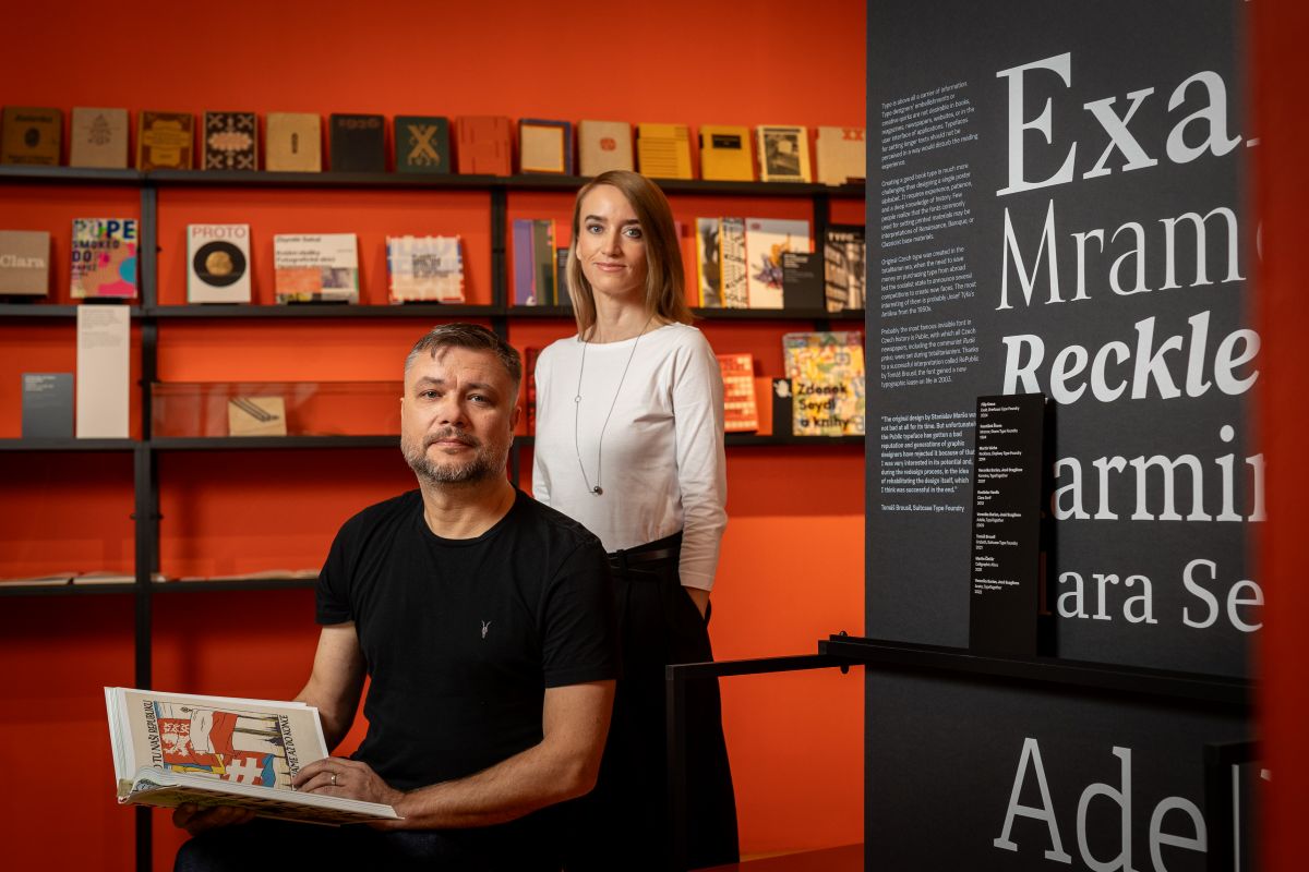
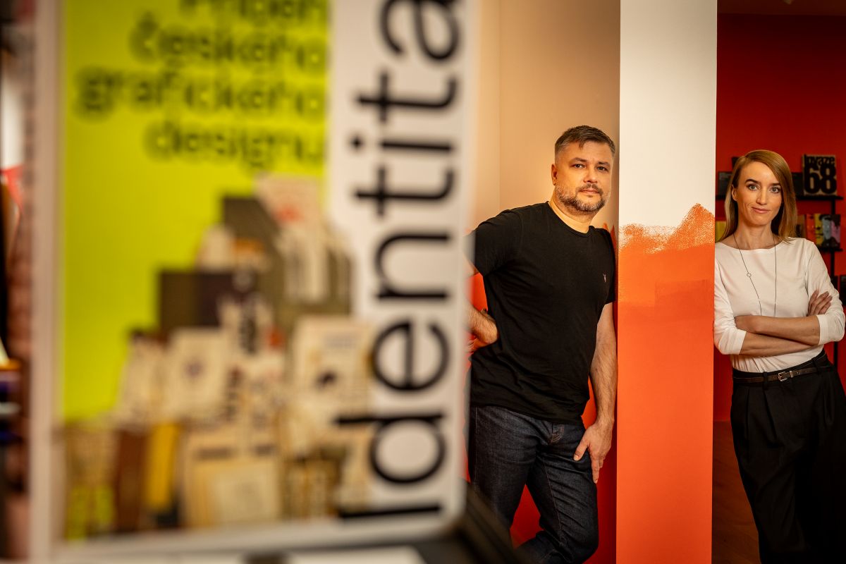
A seven-part documentary series, an insightful monograph full of fascinating case studies, an exhibition at the Kampa Museum, and even a feature film. This is Identita (or Identity), a project that highlights both the past history and present of Czech graphic design. It was created by design experts Filip Blažek and Linda Kudrnovská (graduates of the Faculty of Arts at CU) who clinched a Czech Grand Design Award not long after our interview. In our conversation, Linda and Filip delve into various aspects of design through history, how we - as users - form connections, and discuss how the project came together.
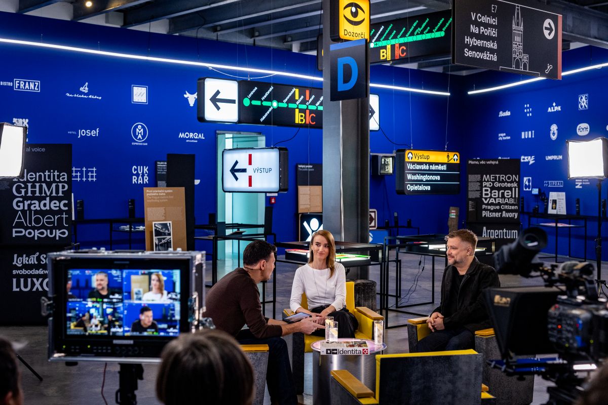
Filip Blažek (right) and Linda Kudrnovská during the filming of Czech TV's Artzóna on the ground floor of the Kampa Museum of Modern Art.
Excerpts from our interview:
Beginnings
“The original idea came from the fact that the whole field was being neglected in the Czech domain or narrative. The main idea behind it was simply to spread the word about Czech graphic design and its history.”
“We noticed one day that when the Nejkrásnější české knihy competition, recognising the most beautiful Czech books of the year, was announced, many in the media – many of the newspapers or other outlets – didn't mention any of the designers at all! Just the authors and the publishers. But the competition is about designers, and yet they were completely ignored. That was one small piece of the puzzle that stuck in our heads and eventually became Projekt Identita – The Identity Project.”
It’s a series, it’s a book, it’s a film… Are you getting it?
“[We never set out to create such a multi-faceted project, but] things grew organically. Originally, we planned only to make a TV series. I'm sure we did not plan to cover anything like the chronological order of Czech or Czechoslovak design, and it didn’t occur to us that we might try to cover the ‘whole’ story. But then when we got the chance to expand Identity, it made sense to do so through the appropriate media.”
“It’s a bit of a paradox, but questions about the budget led to the project becoming much bigger. We realised that sponsors were not interested in backing a stand-alone series or a book on their own. But a project combining different aspects? That caught their attention: something visible, which would also visibly highlight their support. Formally, one thing that readers, viewers, and attendees all soon realise is that each is not a copy of the other. They may overlap, but they are not the same. The book doesn’t repeat the film, and the TV series doesn’t repeat the book. They are aimed at slightly different audiences, which is another reason why we accepted the project becoming bigger as we went along than we had originally planned.”
Why Identity? As opposed to something admittedly ‘drier’ like A History of Czech Graphic Design?
“We were looking for a word that is actually used by designers. What is it that we do as designers? We create visual identities. We were discussing it with a friend of ours and he urged us to take the name and to just use it. Identity is a huge part of it. When we started, if you had googled Identity Project, it would have been third, fourth, or fifth on the list. Today, it will probably be first. Because we took it. We took the word ‘Identity’ and made a strong case for it.”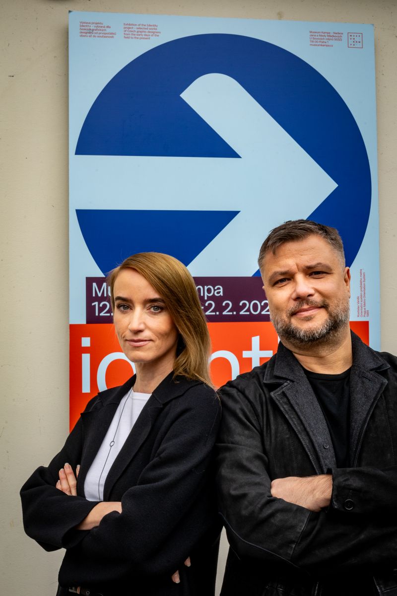
Emotions and past connections
“We noticed a very interesting situation at the exhibition. The older generation were emotional when they saw certain posters. Things that brought back memories, like the atmosphere of streets in 1989, for instance. Some get tears in their eyes when they see certain elements of Czech visual history. But the younger generation doesn’t have that connection. They now have their own influences, and many new and interesting visual inputs that they probably don’t even share in a real public space, but only online. But even then, even an online interface has an appearance and was designed. We will have to wait and see how they feel about that experience one day.”
Design in Czechoslovakia’s First Republic
“The original heyday period in Czechoslovak design lasted a mere 20 years or so, from 1918 to 1939. At the time, Czechoslovak culture became an integral part of European culture. There was no east and west back then. We were just part of the movement. And for some reasons, the ideas created around schools like Bauhaus or similar movements, De Stijl in the Netherlands, or ideas by László Moholy-Nagy in Hungary, or Russian Constructivism, somehow were adopted and further improved in Czechoslovakia, and even accepted by the general public. However, it never became mainstream. If we look at the book covers now, we realise that the book culture of the First Republic was much more varied. You could see covers drawn by hand, by painters, and by constructivists, minimalist, traditionalist, almost classic covers. All side by side. Today, we appreciate works by Karel Teige, Ladislav Sutnar, and other perfect designers considered modernist or avant-garde. [But there were others, and it was a very vibrant picture at the time.]”
Aspects of design under communism
“Censorship was all around, and there was also a kind of auto- or self-censorship. Designers didn't express themselves completely because they were afraid to do so. They had an idea of how far they could go: between roughly 1948 and 1989, individual works of design had to be presented to committees, which were themselves composed of professional designers as well as members of the Communist Party. They took care that if they saw something illegal or potentially dangerous or just fishy, a design would have to be changed.”
“When it came to industrial production, it is important to remember that there was no competition, so they didn't have to care. They could produce the same object for 20 years. And if you look at the history of cars from the communist countries, you realise that some of them were produced for 40 years with one or two facelifts! Over three or four decades! It's no wonder that we all have the same memories.”
“There is a paradox in this: if you look at the 1958 World’s Fair or Expo in Brussels, these world-class exhibitions usually showed very, very special designs coming from Czechoslovakia. But they showed things that were not available here! So obviously the talent was still here after the Communist takeover in 1948, but their talents were not implemented or used in day-to-day situations.”
Cultural Studies made a big difference for us, personally
“My studies at the Faculty of Arts expanded my curiosity about things: that is something that I would never have gotten anywhere else. I'm not saying that just because we are sitting here on university premises – I really cannot be thankful enough for all the sparks of interesting things that I learned from teachers who showed me different paths to different fields. I would not trade Cultural Studies for anything.”
“Absolutely. When we are doing design, we are constantly seeking ‘context’. We are constantly looking at design as part of culture, as part of society, and the relationships between them. Because graphic design influences society. Society influences graphic design. It's mutual, and it's an important part of our life – maybe not the most important like other industries or subjects – but we can’t live without it. It's all around us from morning till night, and it has powers, and we should realise its effects and put them into context.”
| Forum Radio - Interview / Episode 20/ Filip Blažek and Linda Kudrnovská - Society and graphic design / Runtime: 28 min. and 53 sec. |
Linda Kudrnovská studied cultural anthropology at the Faculty of Arts, Charles University. A design theorist, author, and editor of the international yearbooks 365typo & 52typo: Stories on Type, Typography and Graphic Design, she served as the editor-in-chief of the Typo magazine, focused on graphic design, typography, and visual communication, from 2002 to 2012. Since 2016, she has collaborated with the international type foundry TypeTogether. She regularly contributes to various European design periodicals, is a judge for international design competitions, and has been a long-standing member of the board of the international typographic organisation ATypI.
Filip Blažek did cultural studies at the Faculty of Arts at Charles University. Since the mid-1990s, he has been lecturing on typography and leading workshops both in the Czech Republic and abroad. He founded the graphic studio Designiq, which specialises in the design of periodicals, books, and corporate identity. He is also one of the main authors of the visual identity of this very magazine, Forum, one of Charles University’s most recognised brands. He is the co-author of the textbook Practical Typography, the publication Posters of the Velvet Revolution, and the textbook Typokniha – A Guide to Print Production. He teaches at UMPRUM (the Academy of Art, Architecture and Design) and at the private university ARCHIP in Prague.


